Data-Driven-Insights-into-Alcohol-Related-Mortality
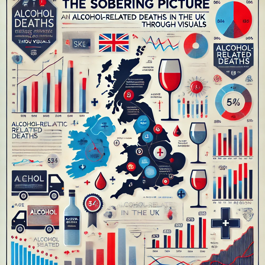
📰 The Sobering Picture
Alcohol-Related Deaths in the UK Reach Concerning Levels 🍷
Alcohol-specific deaths refer to fatalities caused solely by alcohol consumption, where alcohol is the direct and underlying cause of death. These deaths are attributed to conditions such as liver cirrhosis, alcohol poisoning, and alcoholic hepatitis, which result from prolonged alcohol misuse or acute alcohol intoxication. In the United Kingdom, alcohol-specific deaths have been rising, making them a critical public health issue. These deaths vary significantly across different demographics (age and sex), geographical regions, and time periods. Identifying these variations can reveal high-risk groups and trends, providing valuable insights for healthcare professionals, policymakers, and public health organizations.
Understanding alcohol-specific death patterns is essential due to their profound social, economic, and healthcare implications.
- Public Health Significance – Rising Death Rates: Alcohol-specific deaths have been increasing, particularly among middle-aged individuals, necessitating urgent public health interventions.
- Economic Burden: Alcohol misuse places a financial strain on healthcare systems due to the high costs of treating alcohol-related conditions.
- Policy and Healthcare Interventions: Policymakers need accurate data to implement effective alcohol control policies.
By presenting this information through engaging and intuitive visualizations, this project ensures that stakeholders from policymakers to the general public can understand, interpret, and act upon these insights effectively. The ultimate goal is to support data-driven policies and interventions that reduce alcohol-related harm and save lives in the UK.
What This Project Shows
Our visualizations provide key insights into alcohol-specific deaths:
- Who is most affected: Middle-aged males (40–69 years) are disproportionately impacted, making them the most vulnerable demographic.
- Where deaths are highest: Scotland and northern England have the most alcohol-specific deaths, highlighting regional disparities.
- How trends have changed: Deaths have steadily increased over the years, especially from 2015 onward, pointing to an escalating public health crisis.
- Differences between regions and sexes: Males dominate in all regions, but Wales and Northern Ireland show significantly fewer deaths compared to Scotland and England.
These insights offer a comprehensive view of the issue, helping decision-makers prioritize interventions and allocate resources effectively.
Why This Matters
Alcohol-specific deaths are preventable, and understanding the factors contributing to these fatalities is essential for saving lives. By highlighting trends and disparities, this project supports:
- Targeted Health Campaigns: Public health initiatives can be tailored to at-risk groups, such as middle-aged males in high-mortality regions.
- Resource Allocation: Policymakers can direct funding and resources to regions and populations most affected by alcohol-related harm.
- Informed Policy Development: Insights from the data can shape policies like minimum alcohol pricing and expanded addiction recovery programs.
Every life saved represents a win for individuals, families, and communities, reducing the broader societal burden of alcohol-related harm.
Key Visualisations
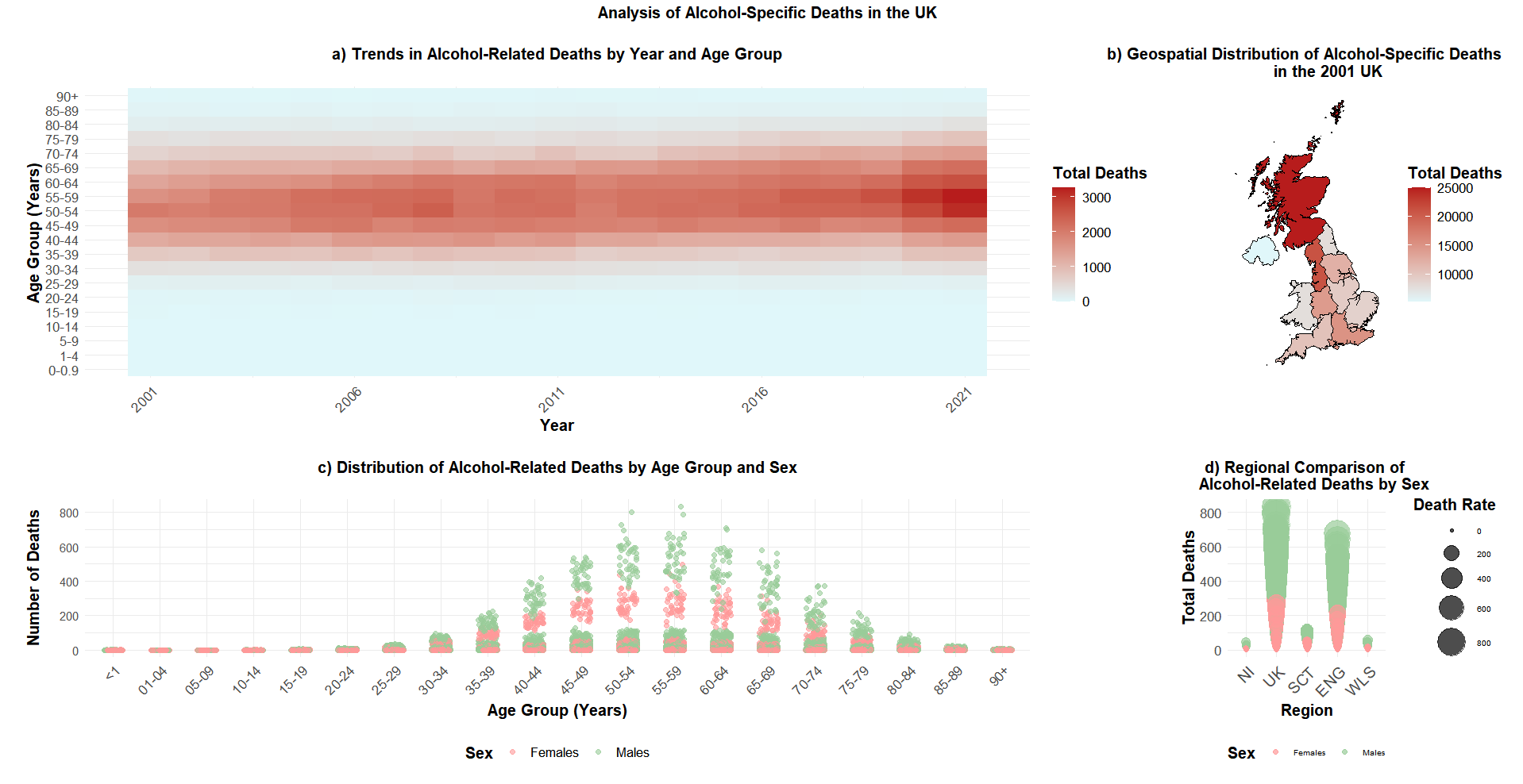
1. Trends in alcohol-specific deaths across different age groups and years.
Key takeaway: Middle-aged groups (40–69 years) consistently face the highest risk. Death rates have surged in recent years, especially from 2015 onward.
Why it matters: This heatmap visualization reveals where interventions are needed most urgently, both in terms of age demographics and time periods.

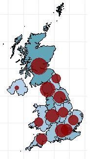
2. Regional differences in alcohol-specific deaths for the baseline year of 2001.
Key takeaway: Scotland stands out with the highest mortality rates, while Wales and Northern Ireland report significantly fewer deaths.
Why it matters: The map highlights the geographic disparities in alcohol-related harm, supporting region-specific policy responses.
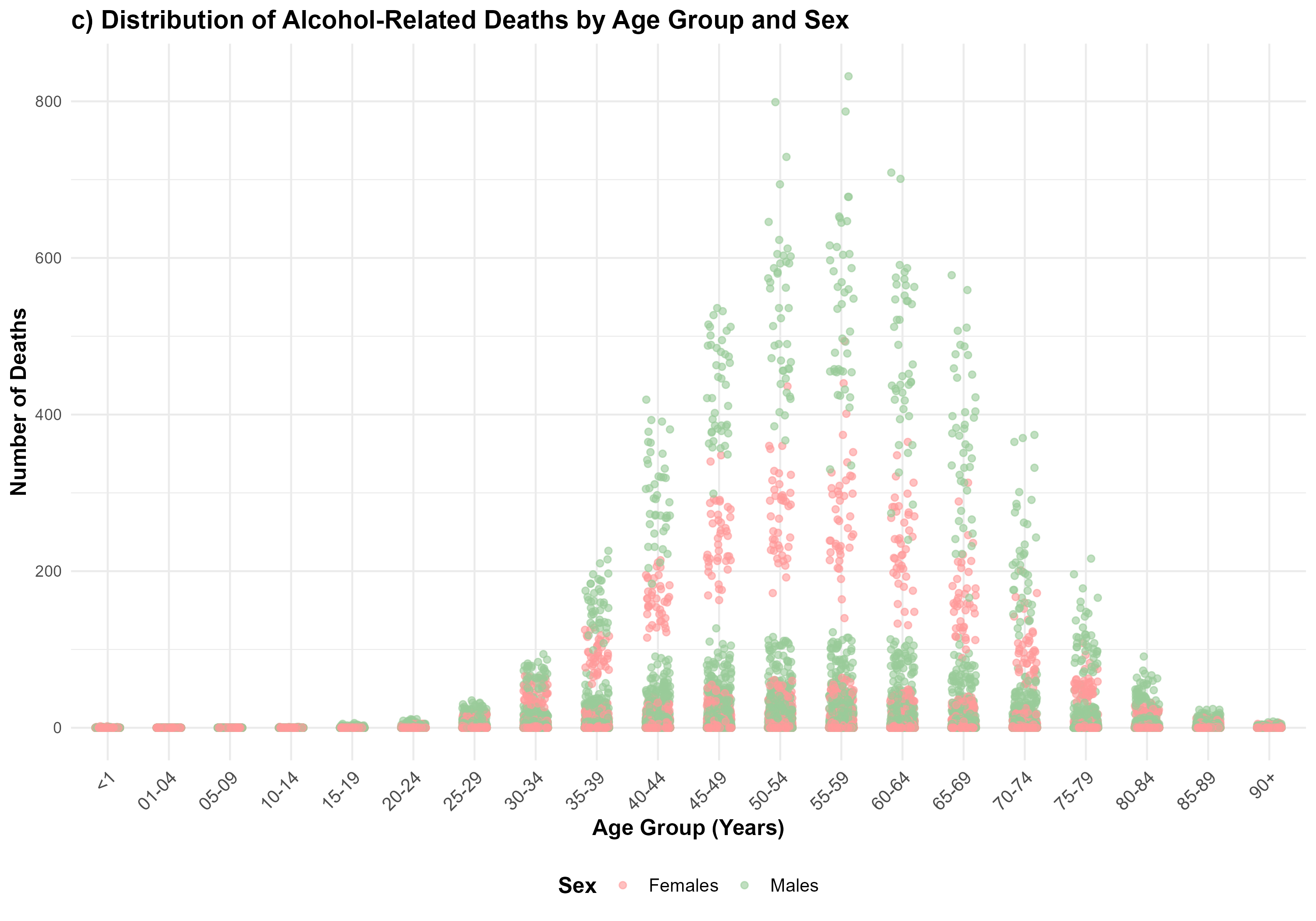
3. Disparities in alcohol-specific deaths by age group and sex.
Key takeaway: Males dominate across all age groups, with a sharp peak in the 50–59 age range. Females are consistently affected at lower rates.
Why it matters: This Scatter plot underscores the need for gender-specific health interventions and further research into the underlying causes of these disparities.
4. Regional and sex-based differences in alcohol-specific deaths.
Key takeaway: England and Scotland dominate in terms of total deaths, with males disproportionately affected. Wales and Northern Ireland report the fewest deaths.
Why it matters: The bubble plot visually combines regional and sex-based differences, providing a holistic view of where interventions should be focused.

Why You Should Care
Alcohol-related harm doesn’t just affect individuals—it impacts entire families, communities, and economies. These insights can:
- Drive public health campaigns that save lives.
- Inform government decisions on funding and resources.
- Raise awareness of alcohol-related harm and its preventable nature.
Understanding these patterns isn’t just about statistics; it’s about real people and real change. Together, we can address this public health crisis and build a healthier future.
How to Get Involved
- Share This Information: Spread awareness in your community by sharing these insights.
- Support Policy Change: Advocate for evidence-based policies, like minimum alcohol pricing or improved access to recovery programs.
- Collaborate: If you work in public health, research, or policymaking, contact us to explore how these insights can support your work.
🔗 Trends and Future Prediction
🤝 About Me
I’m passionate about using data to address real-world problems. This project demonstrates my ability to:
- Clean and analyze complex datasets.
- Build predictive models to uncover key insights.
- Communicate findings effectively for both technical and non-technical audiences.
More info about the project: repo
Feel free to reach out or explore the project further: 📧 My Email
Thank you for visiting! I hope this project inspires meaningful discussions about public health and the power of data. 💻📊